LeapGrad | The first job search platform tailored to college students
At-a-glance 👀
LeapGrad is an online recruiting and professional networking platform uniquely designed to transform the job searching experience for higher education students.
MY ROLE
• UX design + User research
• Project managing
• UI design + Iterations
• Pushing through with coffee ☕️
TOOLS
• Figma / AdobeXD / Balsamiq
• Atlassian suite
COLLABORATION
• 1 Product manager
• 2 UX designers
PROBLEM
We sought to build a platform that would support users in comprehending the employment market, gaining new skills, establishing connections, and consequently, instilling confidence to pursue job opportunities and advance their careers.
DESIGN PROCESS
SOLUTIONS
RESEARCH
I. Survey + Interviews
We gathered information from 55 students within the appropriate user segment.
Target users: College students / Master’s students / New Grads.
Age range: 18-27
II. Key findings
We found many students felt that they were undervalued or lacked suitable backgrounds, they found difficulty networking and creating connections, and recruitment is an endless and complicated ‘black box’.
New grads are unaware of how the recruitment process works and are insecure about how they will be evaluated.

"I DON’T LIKE USING LINKEDIN, BUT IT’S THE ONLY OPTION"
III. Competitive analysis
While keeping the above statistic in mind, I analyzed the 4 most popular apps surrounding job search. And I found that almost none of them are tailored for graduates and college students. This then became my opportunity for the solution.

WIREFRAMES
I. Wire framing
It is our goal to have a clean and easy-to-navigate interface for the design.
Job applications, networking, and online live sessions are the three major flows. Moreover, we redesigned the onboarding process to be shorter and easier for users to adapt to.
We looked at LinkedIn, Apple Podcasts, Indeed, and Live Streaming apps for inspirations!✨
II. User testing
With the low-fidelity prototypes, we conducted a usability test with 6 participants and collected their feedback.
We conducted screenings of our user testing candidates to obtain high-quality feedback. This included students who had been job hunting in the past six months, as well as recruiters who had been involved in recruiting cycles over the same time period.
🧑🏽 2 students who are currently interning
👱♂️ Student who recently graduated from the University of Toronto
👩🦰 Student who found her recent position using other recruiting platform
🧑🦱 Co-founder of a startup company looking for employees
🧑🏽🦱 A hiring manager for campus recruiting
Through iterative designs, we have received numerous useful comments from students and companies that could help improve the user flow. And based on the feedbacks we made some high-fidelity prototype features we will implement.
HI-FI PROTOTYPES
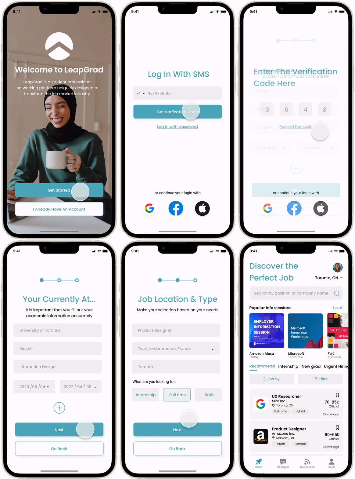
Easy on boarding 🏄♀️
The onboarding process gives users the opportunity to create and save their resume on the platform beforehand.
A quicker onboarding process enables users to swiftly get to the main features and offers the possibility of making adjustments later.

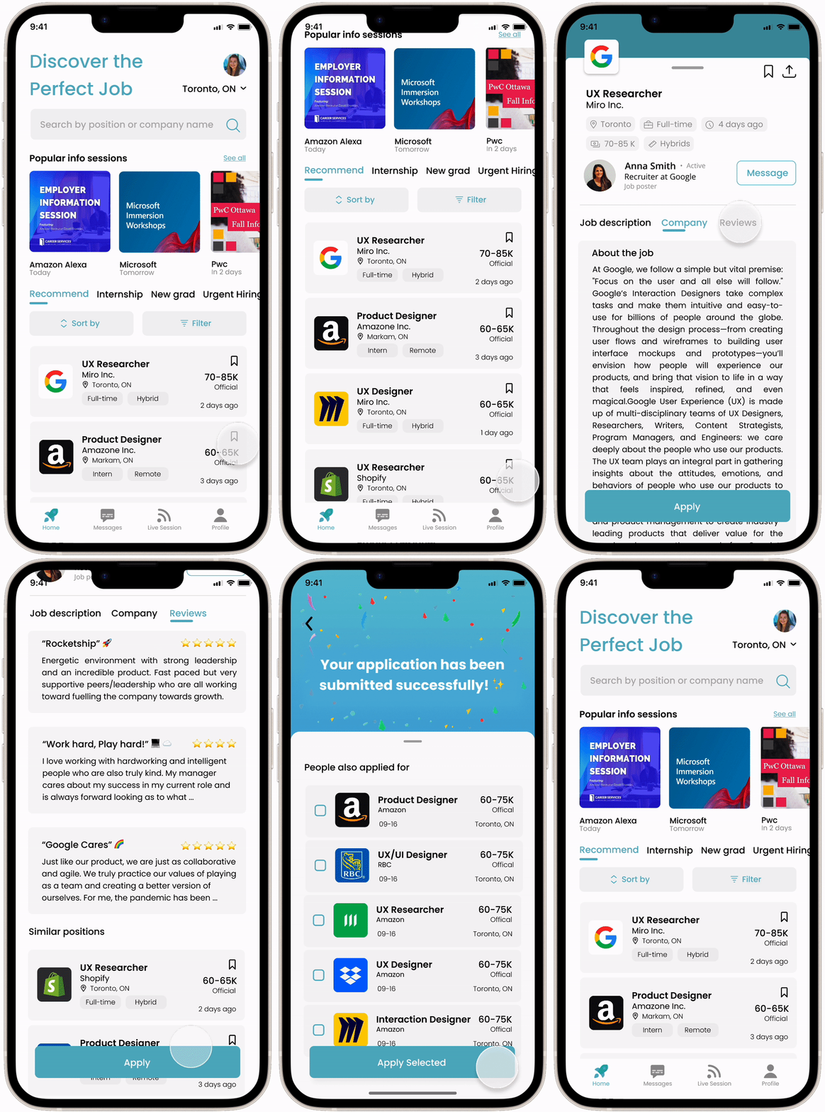
Apply in as few as 2 clicks ⚡️
The screens are organized and presents a comprehensive job description, allowing users to easily understand the requirements with the key elements such as location, job type, salary, etc.
Below the job descriptions, students will be presented with suggested job options, making it easier and more efficient for students to explore job opportunities.

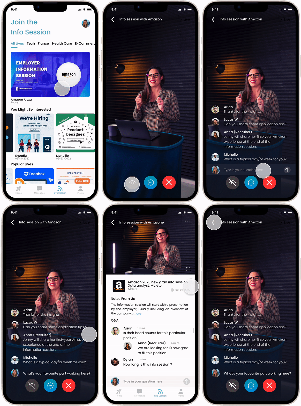
Ask questions in a live info session 👩🎓
A full-screen live session with interactive Q&A elevates the experience of participating in a job session.
During the session, the rolling chat history can be turned off for a better experience.

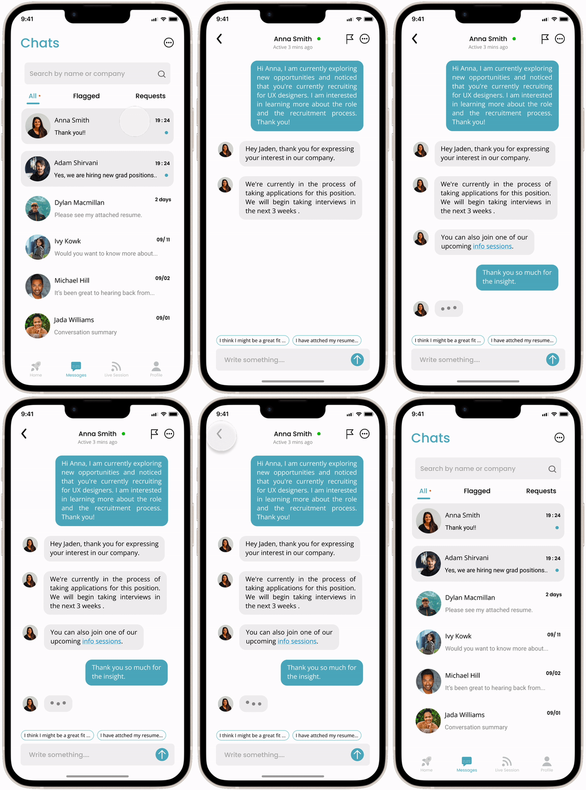
Talk to your recruiters and peers 👍 ✨
Meet with employers to gain insight into the company's culture and available job opportunities.

STYLE GUIDE

REFLECTION
What I thought it took to design a product

What it turns out to be

